In the realm of game development and design, color plays a pivotal role in capturing the attention and emotions of players. The careful selection and application of colors can greatly enhance the overall experience, conveying mood, atmosphere, and even storytelling. In this article, we will explore the importance of choosing the right color palette, discuss popular color pickers and online tools, and delve into the emotional impact that different colors can have on players.
The Power of Color
Colors have the remarkable ability to evoke various emotions and influence human perception. Before diving into the technical aspects, it’s crucial to understand the emotional responses that different colors can trigger:
- Red: Symbolizing energy and intensity, red can evoke strong emotions such as passion, excitement, and urgency. It often finds its place in action-packed or high-intensity games.

- Blue: Associated with calmness, serenity, and trust, blue is commonly used in games aiming to create a sense of tranquility or stability.
- Yellow: Radiating warmth, happiness, and optimism, yellow can inject positivity and vibrancy into game visuals. It’s frequently employed in cheerful and uplifting games.
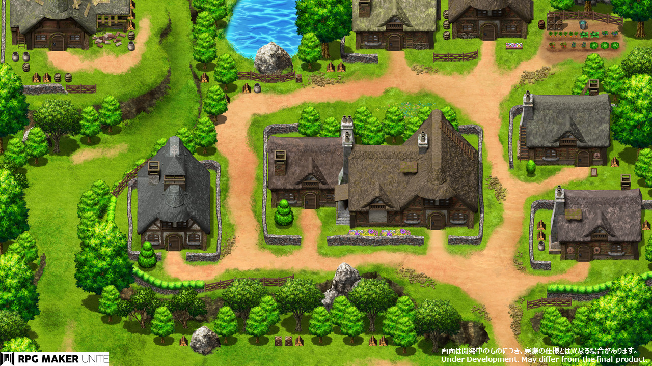
- Green: Representing nature, growth, and balance, green can be used to convey a sense of harmony or to create lush, natural environments.
- Purple: Often linked to mystery, spirituality, and creativity, purple can add an aura of magic or intrigue to a game’s visual identity.
- Orange: Combining the energy of red and the cheerfulness of yellow, orange can ignite enthusiasm and excitement, making it suitable for games that require bursts of energy.
Choosing the Right Color Palette
Now that we understand the emotional impact of colors, let’s explore how to choose the right color palette for your game.
Define the Purpose
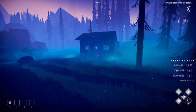
Begin by considering the genre, theme, and target audience of your game. Are you creating a horror game, a puzzle game, or a casual mobile game? Each genre has its own expectations and conventions when it comes to color. For example, a horror game may benefit from a dark and desaturated color palette to enhance the eerie atmosphere, while a casual mobile game might employ bright and vibrant colors to attract and engage players.
Harmonious Colors
Look for colors that complement and enhance each other. Using a color wheel or online tools, explore different color harmonies. Complementary colors, which are opposite each other on the color wheel, can create a strong visual impact. Analogous colors, which are neighboring on the wheel, offer a harmonious and cohesive feel. Triadic colors, which are evenly spaced around the wheel, can provide a balanced and dynamic palette. Experiment with these color combinations to find the ones that best suit your game’s theme and mood.

Mind the Contrast
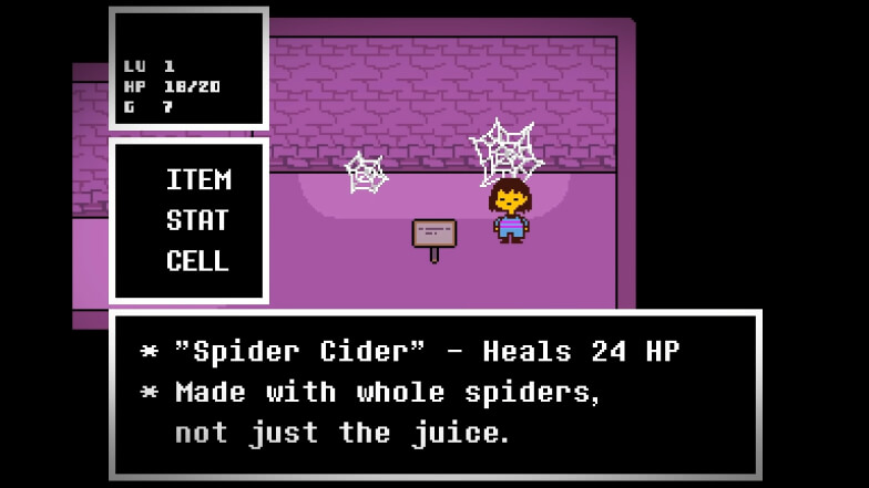
Ensuring sufficient contrast between different elements in your game is essential for improving visibility and readability. Consider the text, user interface elements, interactive objects, and important gameplay elements. A lack of contrast can lead to confusion and frustration for players. For example, if you have light-colored text on a light background, it may be difficult to read. Utilize contrasting colors to make important elements stand out and guide players’ attention. Be mindful of the background color when choosing text and UI colors to maintain readability.
Consider Accessibility
Accessibility is a crucial aspect of game design. Pay attention to color-blindness and visual impairments. Certain color combinations can be challenging for individuals with color vision deficiencies. Choose colors that are easily distinguishable and avoid relying solely on color-coding for critical information. Incorporate other visual cues such as icons, symbols, or patterns to supplement color distinctions. Additionally, test your game with color-blind simulation tools or seek feedback from individuals with color vision deficiencies to ensure your color palette is inclusive and accessible to all players.
Color Pickers and Online Tools
Fortunately, there are numerous color pickers and online tools available to assist in your color palette selection:
- Adobe Color CC: A popular online tool that provides color wheel options, harmonious color suggestions, and the ability to explore color schemes shared by the community.
- Coolors: This online platform generates color palettes based on your preferences and offers integration options with design software.
- Paletton: An intuitive color picker that allows you to experiment with different color harmonies, providing instant feedback on the resulting combinations.
- Color Hunt: A curated collection of trendy color palettes, constantly updated by designers, which can serve as inspiration for your game’s color scheme.
Choosing and adding the right color palette to your game development and design is a creative endeavor that requires careful consideration. Understanding the emotional impact of colors and employing online tools and color pickers can greatly assist in finding the perfect combination that enhances your game’s visual appeal. By leveraging the power of color, you can create immersive experiences that resonate with players and elevate your game to new heights.


